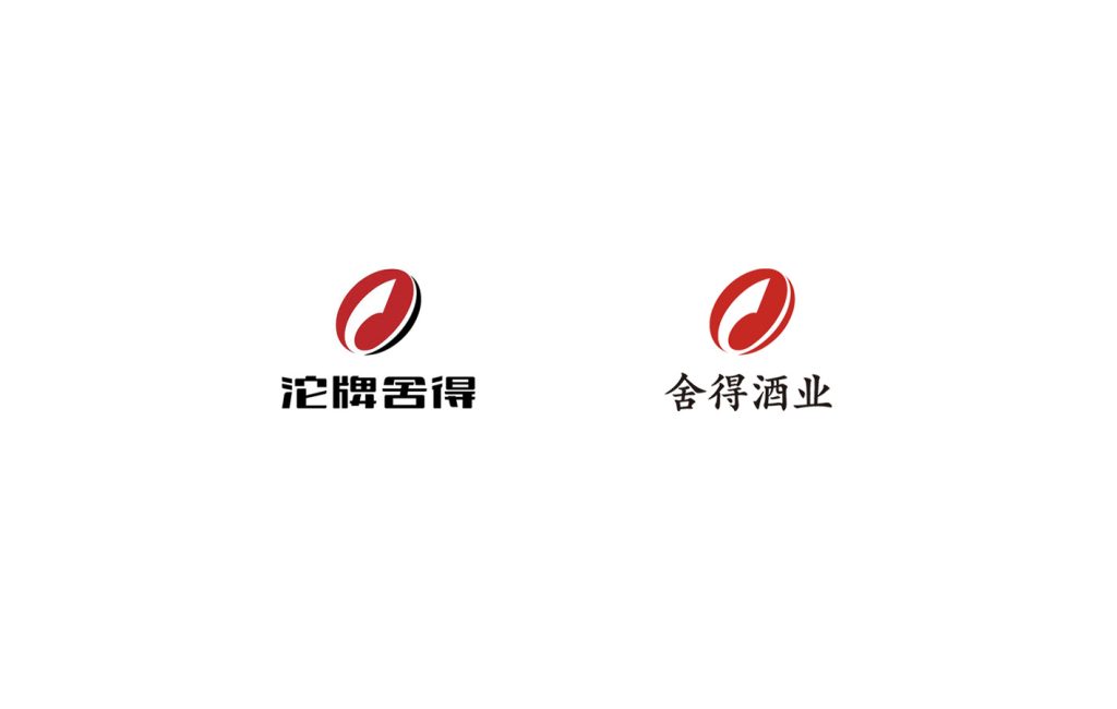
From TuopaiShe to Shede spirits.
“SheDe spirits”, a well-known Chinese Baijiu brand, previously called “TuoPai SheDe,” a name formed by combining two sub-brands: the lower-end “TuoPai” and the high-end “SheDe.” Initially, for financial reporting, this mix limited its growth.
While serving as Director of the brand center at SheDe Spirits’ parent company, I led the rebranding to streamline the name to “SheDe Spirits,” focusing on its high-end image. This move not only upgraded the brand image but also shaped a business strategy where the premium line leads the market.
As the client, I couldn’t resist making changes to the main logo. The upgrade reflects the spirit of ‘SheDe’: 1. Simplifying the logo’s colors from the previous red and black to just red, and changing the font from a stylized design to the more applicable SimSun. (Based on the main logo I provided, MetaDesign performed a professional and comprehensive brand image upgrade for the brand.)”
In Chinese, ‘SheDe’ represents a form of wisdom, roughly equivalent to ‘letting go’. This brand upgrade, through the act of ‘letting go,’ has paved the way for new growth opportunities.
If an agency aimed to drive this change, it would seem almost impossible. But with a determined “Alpha” behind you, it suddenly becomes easy.
Thanks you Mr. Zhou Zhen. I learned a lot from you.